Apto Payments has a new brand identity that reflects what it means to prioritize accessibility and velocity.

At Apto, we strive to show rather than tell our partners and customers that we live by our mission of enabling innovative and inclusive payments solutions with velocity.
We primarily do this by providing an easy-to-use platform that empowers developers to launch all sorts of innovative new card products in days rather than years.
However, we also wanted to show our values of inclusion and velocity through our visual identity.
Introducing — Apto’s refreshed visual identity!
As mentioned above, our vision is to enable innovative and inclusive payments solutions with velocity. We are moving the Apto brand forward to ensure it is a visual and experiential representation of this mission.
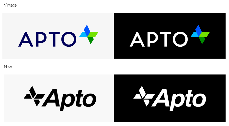
Our new logo has improved composition and symmetry. The font captures qualities of forward motion and agility, demonstrating our commitment to velocity.
We also have a new logomark.

The spectrum of colors represents our vision of a more inclusive, accessible financial system in which any developer with a great idea can launch a new card product.
We are excited to power some of the most innovative card programs, and we hope to continue to do so in style.
If you’re interested in learning more about Apto, we’d love to hear from you! Please contact us here.